
affectUI
Search, read and install agent-ready React components, screens and blocks for AI products.
One address for any MCP client. No sign-in needed on this server.
What it does
4 read
Grouped by tool name.
What it costs
FreeOdel charges nothing per call. The publisher may charge for its own service.
Tools
4 · grouped by tool name · checked 10 Oct 2026Read · 4Look things up
- search_components
- list_components
- get_component
- get_source





Website · Browse components · Docs · Install · Pro
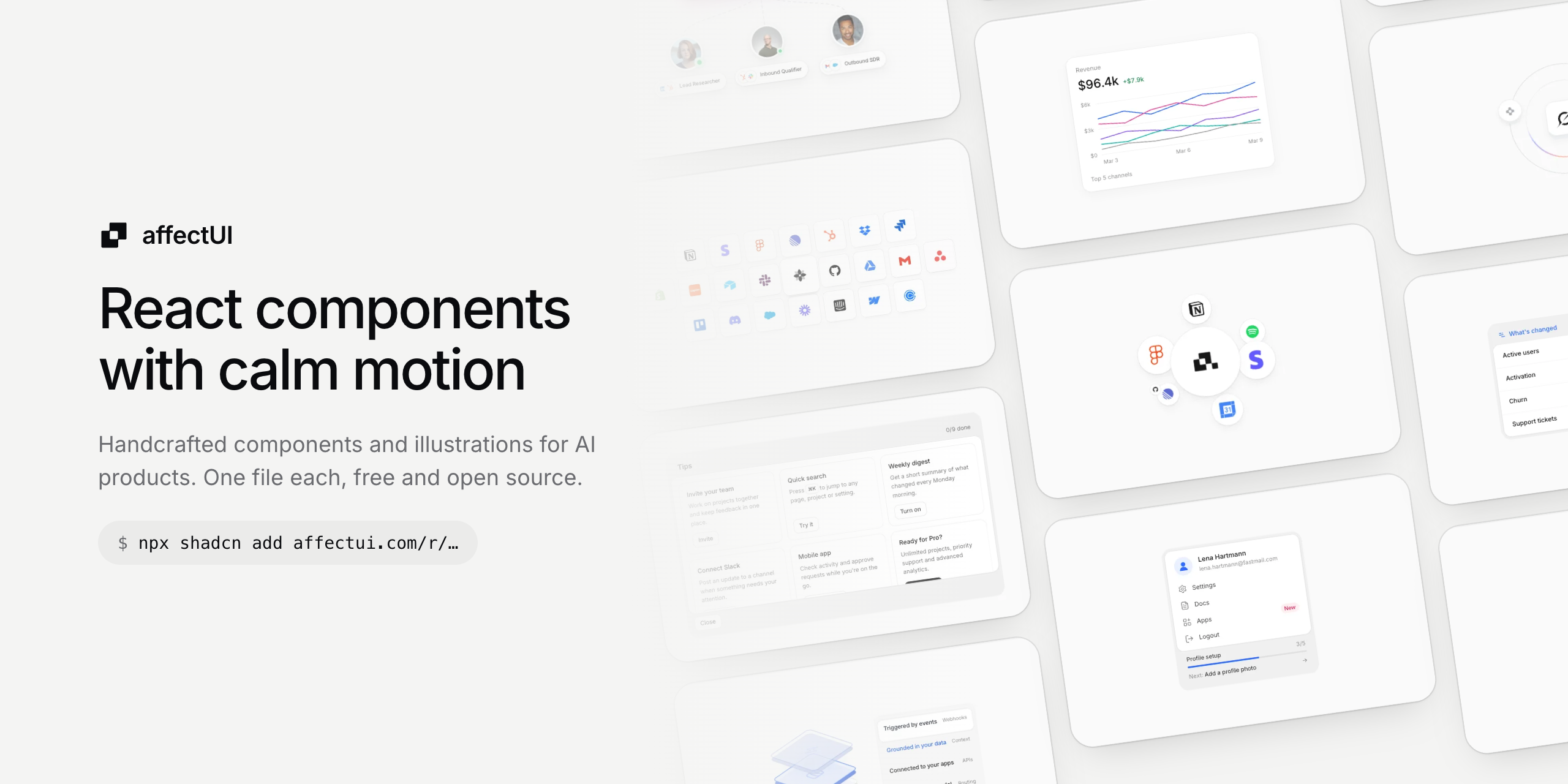
affectUI is a library of handcrafted React components, illustrations and motion effects for AI products and modern SaaS apps. Every item is one .tsx file with its styles inside: no Tailwind, no CSS setup, no animation library. Install it with the shadcn CLI or copy the file, and it is source you own.
Showcase
A few favorites, recorded live from affectui.com. Items marked Pro are part of affectUI Pro and are not in this repository; everything else installs from here for free.

Agent Team A prompt types itself and branches out into three agents, each with a role and overlapping tool logos |

Reaction Bar Like, comment, repost and share in one pill – icons pop and fill, counts roll in digit by digit |

Team Invite Connected teammates – a cursor drags a new one into the empty slot, the line turns solid and they go online |

Command Menu Pro Search and run anything from one field – tool actions with logos and ⌘1–⌘5, everyday commands with icons |

Progress Tracker Onboarding checklist with an animated progress bar, ticks that draw themselves and auto play |

KPI Chart Pro Metric card with a multi-line chart and a tooltip that follows the pointer |

Model Wheel AI model names on a turning drum – the rows bend away at the edges and each model lands on a soft gray fill |

Logo Cluster Your mark on a white disc in the middle – company logos bounce out of it and settle around it |
Contents
- Why affectUI
- Install
- Usage
- Use it with AI tools
- Components
- Blocks
- Illustrations
- Motion
- affectUI Pro
- Contributing
- License
Why affectUI
- One file each. Every component is a single
.tsxfile with its styles inside. Nothing to configure, no CSS framework required. - Motion that feels finished. Morphs, staggered reveals, rolling numbers and smooth state changes, and all of it respects
prefers-reduced-motion. - Dark mode built in. Each item switches when an ancestor has the class
darkordata-theme="dark". - Accessible by default. Real buttons, labels, keyboard support and live regions where they matter.
- Responsive. Container queries, so items adapt to the space they get, not just the window.
Install
Requirements
- React 19, with or without TypeScript
- Any React setup: Next.js, Vite, Remix or plain React
- The
@/*import alias if you use the shadcn CLI (Next.js and shadcn set it up by default)
With the shadcn CLI
Every item has its own registry URL. Run the command from its page on affectui.com or from the tables below:
npx shadcn@latest add https://www.affectui.com/r/reaction-bar.json
The file lands in components/ui, ready to import.
Prefer short names? Register the namespace once in components.json:
{
  "registries": {
    "@affectui": "https://www.affectui.com/r/{name}.json"
  }
}
npx shadcn@latest add @affectui/reaction-bar
Copy and paste
Open the item's folder in this repository (components/, illustrations/ or motion/), copy the file into your project and import it. That's all it takes.
Usage
import { ReactionBar } from "@/components/ui/reaction-bar";

export function PostActions({ post }) {
  return (
    <ReactionBar
      reactions={{ like: { count: post.likes, active: post.liked }, comment: { count: post.comments } }}
      onReact={(key, state) => api.react(post.id, key, state.active)}
    />
  );
}
Props, keyboard support and accessibility notes for every item are on its page, e.g. Reaction Bar.
Use it with AI tools
affectUI is agent-ready. Connect the MCP server once and Claude Code, Cursor, VS Code or Codex can search every item, read its docs and add it for you:
claude mcp add --transport http affectui https://www.affectui.com/api/mcp
Other clients: add { "mcpServers": { "affectui": { "url": "https://www.affectui.com/api/mcp" } } } to their MCP config. Without any setup, point your assistant at llms.txt or llms-full.txt. Every page on affectui.com also has a Copy prompt bar for Claude, ChatGPT / Codex, Cursor and v0. Setup details: Using with AI.
Components
| Name | What it is | Install |
|---|---|---|
| Button | Primary, secondary, ghost and destructive buttons with icons, sizes and a shimmering loading state | npx shadcn@latest add https://www.affectui.com/r/button.json |
| Change Summary | What moved since last time – one metric per row with a colored trend | npx shadcn@latest add https://www.affectui.com/r/change-summary.json |
| Comment Thread | One comment with replies – an assistant reports what it did, folds open details and answers @mentions | npx shadcn@latest add https://www.affectui.com/r/comment-thread.json |
| Cover Flow | Browse covers in 3D – drag, flick or scrub the row, it springs to the nearest cover; images drift in their frames over a soft reflection | npx shadcn@latest add https://www.affectui.com/r/cover-flow.json |
| Decision Inbox | Open decisions with two quick answers each – answered ones confirm and fold away | npx shadcn@latest add https://www.affectui.com/r/decision-inbox.json |
| Email Draft | Agent-written email for review – switch recipient and tone, edit inline, remove the attachment, send or discard with undo | npx shadcn@latest add https://www.affectui.com/r/email-draft.json |
| Filter Menu | Grouped filters with removable chips, collapsible checkbox groups, Clear all and full keyboard control | npx shadcn@latest add https://www.affectui.com/r/filter-menu.json |
| Notification Stack | Notice cards stacked behind each other – dismiss the front one to reveal the next | npx shadcn@latest add https://www.affectui.com/r/notification-stack.json |
| OTP Input | The verification code field done right – a gliding focus ring, paste and SMS autofill, a calm shake on errors and a morph into Verified | npx shadcn@latest add https://www.affectui.com/r/otp-input.json |
| Profile Menu | Account card with the signed-in user, menu actions and profile setup progress | npx shadcn@latest add https://www.affectui.com/r/profile-menu.json |
| Progress Tracker | Onboarding checklist with an animated progress bar, ticks that draw themselves and auto play | npx shadcn@latest add https://www.affectui.com/r/progress-tracker.json |
| Reaction Bar | Like, comment, repost and share in one pill – icons pop and fill, counts roll in digit by digit | npx shadcn@latest add https://www.affectui.com/r/reaction-bar.json |
| Segmented Control | Switch between two to six options – a raised pill or underline that glides, stretches a little and can be dragged across, with icons, counts and badges | npx shadcn@latest add https://www.affectui.com/r/segmented-control.json |
| Smart Recommendation | Suggestion card with a confidence signal, alternatives to switch to and accept with undo | npx shadcn@latest add https://www.affectui.com/r/smart-recommendation.json |
| Thinking Loader | A small working pill for AI replies – an eight-ray spinner and a shimmering label that rolls through phases and settles on a check | npx shadcn@latest add https://www.affectui.com/r/thinking-loader.json |
| Tips Panel | Grid of short tips with one action each – taken tips turn into a done state | npx shadcn@latest add https://www.affectui.com/r/tips-panel.json |
| Tool Call Card | An agent's tool call in one line – live timer, status and summary, folds open to highlighted arguments and result with copy, retry on errors and a group that sums them up | npx shadcn@latest add https://www.affectui.com/r/tool-call-card.json |
Blocks
| Name | What it is | Install |
|---|---|---|
| Logo Marquee | The endless “Trusted by” strip – a seamless loop that eases to a stop on hover, scrubs with inertia and lifts the hovered logo to colour | npx shadcn@latest add https://www.affectui.com/r/logo-marquee.json |
| Testimonial Wall | The landing-page wall of quotes – columns that scroll endlessly in opposite directions, ease to a stop on hover and scrub with inertia | npx shadcn@latest add https://www.affectui.com/r/testimonial-wall.json |
Illustrations
| Name | What it is | Install |
|---|---|---|
| Agent Team | A prompt types itself and branches out into three agents, each with a role and overlapping tool logos | npx shadcn@latest add https://www.affectui.com/r/agent-team.json |
| DACH Region | DACH map with fading neighbours and a pastel band along the border, switchable to the US, China, India, Brazil or Japan | npx shadcn@latest add https://www.affectui.com/r/region-dach.json |
| Empty Calendar | Stack of calendar cards marked empty, fanning out on hover | npx shadcn@latest add https://www.affectui.com/r/empty-calendar.json |
| Enrichment Orbit | Grok tile inside two rings with comets and data nodes orbiting around it | npx shadcn@latest add https://www.affectui.com/r/enrichment-orbit.json |
| Frost Cloud | A frosted white cloud with eyes cut out of it, on a red-orange or blue sky – it floats, turns to look around, blinks, follows the pointer and bounces with a wink when clicked | npx shadcn@latest add https://www.affectui.com/r/frost-cloud.json |
| Ghosted Chat | Unanswered chat messages marked as read, with a thumbs-down reply on hover | npx shadcn@latest add https://www.affectui.com/r/ghosted-chat.json |
| Glow Cloud | A glowing cloud with eyes in blue or red-orange – it floats, turns to look around, blinks, follows the pointer and bounces with a wink when clicked | npx shadcn@latest add https://www.affectui.com/r/glow-cloud.json |
| Integration Beam | Your product between the tools it connects – light pulses flow along curved beams, hover to focus a tool, click to pause it | npx shadcn@latest add https://www.affectui.com/r/integration-beam.json |
| Integration Grid | Honeycomb-like wall of integration logos around a bright centre tile with your product mark, fading out toward the edges | npx shadcn@latest add https://www.affectui.com/r/integration-grid.json |
| Layer Stack | Isometric stack of five layers with a list beside it – the chosen entry lifts its layer out in color | npx shadcn@latest add https://www.affectui.com/r/layer-stack.json |
| Lead Sourcing | ChatGPT tile linked to Gmail and Grok, with a shine running along the connection | npx shadcn@latest add https://www.affectui.com/r/lead-sourcing.json |
| Logo Cluster | Your mark on a white disc in the middle – company logos bounce out of it and settle around it | npx shadcn@latest add https://www.affectui.com/r/logo-cluster.json |
| Model Wheel | AI model names on a turning drum – the rows bend away at the edges and each model lands on a soft gray fill | npx shadcn@latest add https://www.affectui.com/r/model-wheel.json |
| Side Folder | Glassy blue folder on its side, documents sliding out to the right as the pocket swings open on hover | npx shadcn@latest add https://www.affectui.com/r/side-folder.json |
| Tab Overload | Overlapping browser windows where the highlight follows the hovered tab | npx shadcn@latest add https://www.affectui.com/r/tab-overload.json |
| Team Invite | Connected teammates – a cursor drags a new one into the empty slot, the line turns solid and they go online | npx shadcn@latest add https://www.affectui.com/r/team-invite.json |
Motion
| Name | What it is | Install |
|---|---|---|
| Grid Background | A fine line grid that drifts slowly behind your content and fades out towards the edges | npx shadcn@latest add https://www.affectui.com/r/grid-background.json |
| Number Ticker | Odometer-style numbers – every digit rolls to its new value and counts in from zero when it scrolls into view | npx shadcn@latest add https://www.affectui.com/r/number-ticker.json |
| Shimmer Loader | Skeleton blocks that share one soft light sweep, plus shimmering text for “Thinking…” states | npx shadcn@latest add https://www.affectui.com/r/shimmer-loader.json |
| Text Reveal | Text that arrives word by word or letter by letter – each piece rises out of a soft blur as it scrolls into view | npx shadcn@latest add https://www.affectui.com/r/text-reveal.json |
affectUI Pro
52 more components, screens, blocks and illustrations, including the Command Menu, the Chat Composer, the KPI Chart, the Pricing Plans block and full app screens, are part of affectUI Pro: a one-time purchase with lifetime updates. Their source is not in this repository.
Contributing
Found a bug or missing a component? Open an issue. The files here are synced from the affectUI source on every release, so fixes land through issues rather than pull requests. See CONTRIBUTING.md.
License
Everything in this repository is released under the MIT license. Use it in personal and commercial projects. Logos shown in previews belong to their owners and are only sample content.
If affectUI saves you time, a ⭐ helps others find it.
Made by Flo