Listed from the MCP registry; nobody on Odel publishes it.

coolicons
Search coolicons by meaning, then get SVG source and the right import in any style and radius
Runs on your machine from its package; the steps are below.
What it does
- Reads
- Writes
- High impact
At most: only reads or looks up information.
What it costs
FreeOdel charges nothing per call. The publisher may charge for its own service.
Runs locally over stdio
This server isn't hosted — your MCP client launches it from a package registry. Use one of the commands below, or drop the config into your client (e.g. Claude Desktop).
Run
npx -y @coolicons/mcp
MCP client config
{
  "mcpServers": {
    "coolicons": {
      "command": "npx",
      "args": [
        "-y",
        "@coolicons/mcp"
      ]
    }
  }
}
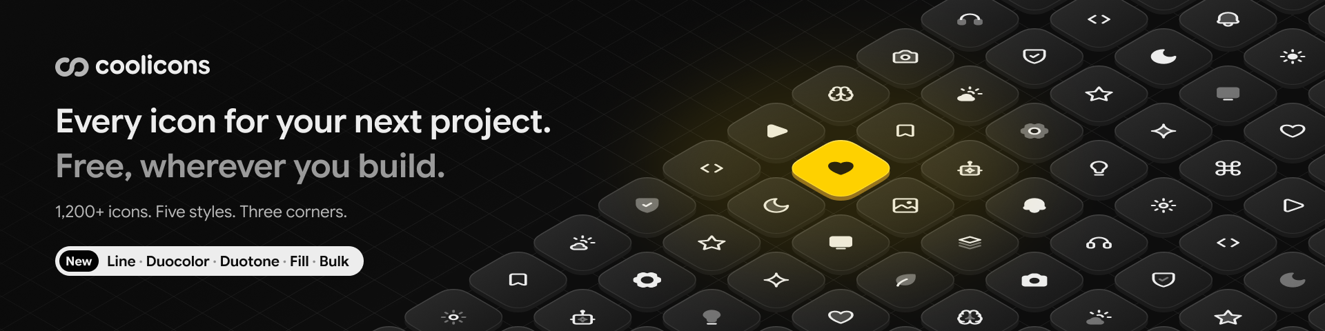
1,500+ free icons in five styles, with sharp, regular or round corners,
for React, Vue, shadcn/ui, SVG and Figma.
Browse all icons · Docs · Figma file · Changelog




| 1,500+ | 5 | 3 | 23,000+ | 500k+ |
|---|---|---|---|---|
| icons in 30 categories | styles, Line to Bulk | corners, sharp to round | SVG files | Figma downloads |
Why coolicons
Icons that match your interface. Each icon comes in Line, Duocolor, Duotone, Fill and Bulk, with sharp, regular or round corners. A rounded app gets round icons, a sharp dashboard gets sharp ones, and you can change your mind later without touching a single drawing.
Sharp at 24 pixels. The icons sit on a 24 by 24 grid with a 2 px stroke. Lines and corners land on whole pixels, so edges stay crisp at their native size.
Where you work. Find and adjust icons on coolicons.cool, use the Figma file, or install the packages below. Coding agents get an MCP server, a CLI and a skill, so they look names up instead of guessing.
Made by
Kryston Schwarze, design engineer from Germany, drawing icons since 2018.
Figma
The coolicons file on Figma Community has the whole set as components, with style and corners as properties.
Packages
| Package | |
|---|---|
@coolicons/react | React components |
@coolicons/vue | Vue 3 components |
@coolicons/svg | SVG files and a manifest for everything else |
@coolicons/cli | Search and copy icons from the terminal |
@coolicons/mcp | MCP server for coding agents |
React
npm install @coolicons/react
import { House } from "@coolicons/react";

export function Home() {
  return <House size={20} />;
}
Vue
npm install @coolicons/vue
<script setup>
import { House } from "@coolicons/vue";
</script>

<template>
  <House :size="20" />
</template>
SVG
npm install @coolicons/svg
Every icon is a file at @coolicons/svg/<style>/<radius>/<name>.svg, for example @coolicons/svg/line/regular/house.svg. manifest.json lists each icon with its category and a fingerprint per file. Each release on GitHub also has all files as a zip.
Styles and radii
| Style | |
|---|---|
line | Strokes |
duocolor | Strokes with a lighter second stroke |
duotone | Strokes over a light tone |
fill | Solid shapes |
bulk | Solid shapes over a light tone |
Each style comes with sharp, regular and round corners. The package root is Line with Regular corners. Every other combination has its own entry, and only the icons you import end up in your bundle:
import { House } from "@coolicons/react";
import { Folder } from "@coolicons/react/fill";
import { Bell } from "@coolicons/react/bulk/round";
Icons use currentColor and take the text color around them.
Props
| Prop | Default | |
|---|---|---|
size | 24 | Width and height in pixels or any CSS length |
strokeWidth | 2 | Stroke width of Line, Duocolor and Duotone. Fill and Bulk have no strokes |
secondaryColor | currentColor | Color of the second path in Duocolor, Duotone and Bulk. Line, Fill and icons without a second path ignore it |
secondaryOpacity | 0.4 or 0.2 | Opacity of the second path: 0.4 in Duocolor and Bulk, 0.2 in Duotone |
title | Adds a <title> and role="img". Without a title the icon is hidden from screen readers |
All other attributes go to the <svg> element.
Both secondary props take any CSS value, also variables, so the second path can follow your theme. Give the variable a fallback, because an unset variable does not fall back to the default.
<CalendarEvent secondaryOpacity="var(--icon-tone, 0.2)" />
.dark {
  --icon-tone: 0.4;
}
Names
Names are lowercase English words joined by hyphens, like file-plus-corner. Components use the same words in PascalCase, like FilePlusCorner, and are also exported with an Icon suffix, like FilePlusCornerIcon. Both names always work.
Use the plain name unless JavaScript, the browser or a framework already uses it. Map is a JavaScript global, File a browser global and Link a component in Next.js and React Router. Importing an icon with such a name hides the original in that file, so value instanceof File quietly stops working. For these icons, use the suffix:
ActivityIcon, BluetoothIcon, ClipboardIcon, CodeIcon, ComponentIcon, FileIcon, FontIcon, FunctionIcon, GamepadIcon, HistoryIcon, ImageIcon, InfinityIcon, KeyboardIcon, LabelIcon, LinkIcon, LockIcon, MapIcon, ModalIcon, NavigationIcon, OptionIcon, PresentationIcon, RouteIcon, RouterIcon, ScrollIcon, SettingsIcon, ShareIcon, TextIcon, WindowIcon
The list covers the globals of JavaScript, browsers, Node, Deno, Bun and React Native, and the exports of React, Next.js, React Router, TanStack Router, React Native, Expo Router, Vue, Vue Router, Solid, Svelte, Preact, Angular, Astro, Qwik, Lit, Inertia and Gatsby.
Some icons have a second name, like reply for arrow-u-turn-up-left. Both point to the same component.
Icons by name
When the icon comes from data, like in a CMS or an icon picker, CooliconsIcon renders it by its name. It loads all icons of one style and radius on first use, about 60 KB gzipped for Line and 230 KB for Bulk.
import { CooliconsIcon, icons } from "@coolicons/react/dynamic";

<CooliconsIcon name="house" variant="fill" radius="round" />
icons lists every name with its category, preload(variant, radius) loads a style ahead of time.
Coding agents
Agents do not know coolicons names from their training data. Three tools let them look names up instead of guessing:
@coolicons/mcp | MCP server with search, SVG source and imports: claude mcp add coolicons -- npx -y @coolicons/mcp |
@coolicons/cli | Search and copy icons from the terminal: npx @coolicons/cli search date |
| Skill | Teaches agents the packages and naming rules: npx skills add krystonschwarze/coolicons |
All three work offline, the whole set ships with them.
Versions
All packages share one version. From 5.0.0 on, a major version removes or renames icons, a minor version adds icons and a patch redraws icons or changes categories. A renamed icon keeps its old name until the next major version.
Brand icons
The brand icons show logos of other companies. The trademarks belong to their owners. The MIT license covers the drawing, not the trademark. If you use a logo, follow the brand guidelines of its owner.
License
MIT © Kryston Schwarze